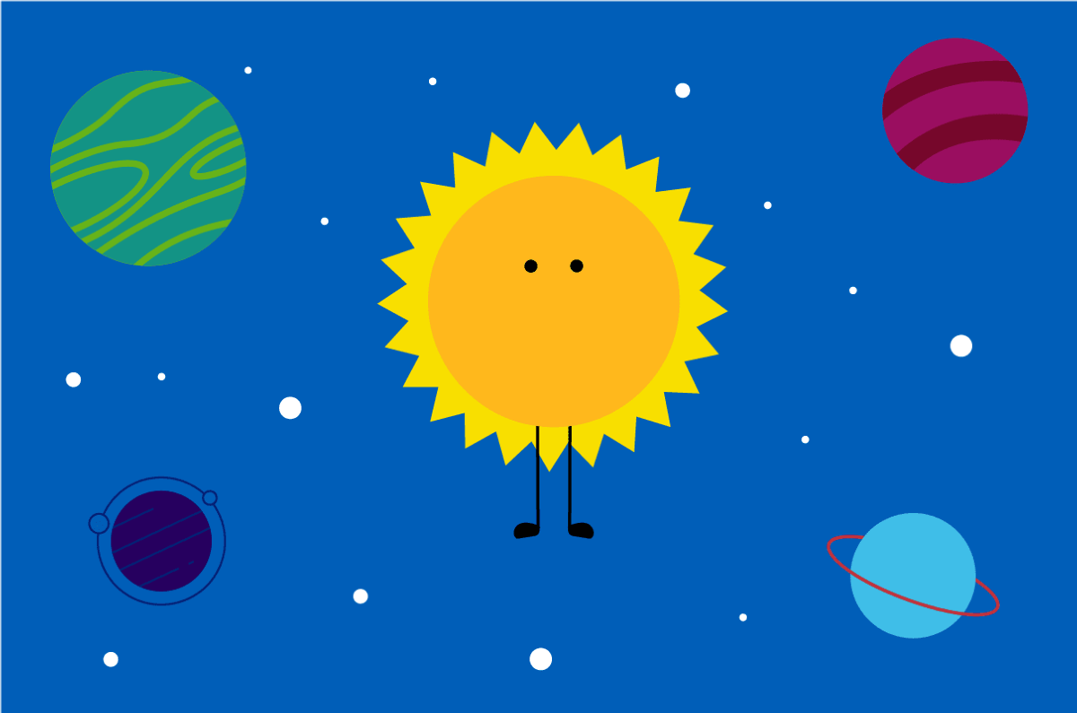
YBH top banner image showing Sunny on a blue background in space

[Service name] in header 2

Describe your service in 1-2 sentences, drawing out its unique selling points.

All service pages should have this banner. You can duplicate from the text content called "YBH: Page banner"

  • The style placement is called Barts Health - page banner with text
  • Place in the top row.
  • Set show headline to 'no' from the edit text content placement in layout view.
Sunny gif

Welcoming intro text (header 2)

Help children and their families prepare for their visit

Staying in hospital or coming in for a medical appointment can be a daunting experience, but we are here to support you and your child during their time with us.

  • This text is formatted automatically after you apply header 2 to your top line.
  • Use your second paragraph to pull out your key message.
  • The image is called: Waving Sunny gif.
  • Set show headline to 'no' in edit text content placement from layout view.

Developing your service content

So you want a page on the website?

Having a page on the website is one the best ways of communicating with patients, partners and the public. In a standard week, there are 34,000 visits to the website. Every time someone visits the site, they look at 2.35 pages in 1:47 minutes. That is just 45 seconds per page... and more than half of these visits are on a mobile device (55%).

People are busy, and they need information quickly.

What are you trying to achieve with your page?

Every page is designed to help people choose Barts Health as a place to be cared for, or to find out more information about their care before their appointment. Some of the typical things people visit a service page on our website is to:

  • find the contact details of the service
  • find out about the ward or facilities
  • get to know their consultant
  • refer a patient to the service, or
  • decide on whether they wish to work for the trust

Start planning your page

What problem are you trying to solve?

Start with understanding what your audience(s) need to know about your service.

  1. What do they contact you about?
  2. What are the main questions they ask you?
  3. What do people get frustrated about?
  4. Can you improve their experience before and after their care?
  5. Can you save time for yourself or others by providing the information they need in an easy to use format?
  6. Can you promote your service to potential employees?

These small actions should form the basis of what your page needs to communicate. Consider what information is already provided by trusted websites, such as NHS.uk and reputable charities. It may be more appropriate and suitable to signpost to these organisations than duplicate resources and effort.

Make a formal request for a page

Managing your website page may sound easy, but to do it right, you need someone dedicated to manage the page, keep it up to date and keep it useful.

Before you jump in, read our guide: The role of a page owner[docx] 179KB.

If you are sure you're the right person, and you have thought about your page, please complete an online request form.

You've been accepted!

Now the hard part begins... what content is going on your page?

  1. Start planning your content using our guide: Writing for the website template[docx] 372KB
  2. Use our writing for the web tips, which can be found on this page.
  3. What documents are you adding to the page? Make sure you have saved them with a useful file name and thought about a description for when you add each one to the system. Collate them into one folder so you have everything together for when you need it.
  4. What are the search terms you want to add to the page, and each document, to help people find your content? Add this to your Word document for easy access later.
  5. Consider linking your consultants to the page, and encourage these consultants to complete their biography using our Consultant directory profile template [docx] 17KB.

Tips for writing for the web

Always think about accessibility

  • One in 30 people live with sight loss in the UK
  • Screen readers, magnifiers and recognition software can help people access online content
  • This demo shows how screen readers work (skip to 6 min 30)

Top tips

  • Avoid ‘click here’, ‘on the website’, ‘read more’ hyperlinks. A good test is to see if you can understand what the link is about when read in isolation. If the hyperlinks were read out in a list would they make any sense?
  • Reading age is important to consider. There are lots of online platforms to check it for you: Microsoft can rate your readability in Word and Outlook or try the Hemingway Editor
  • Colour contrast and font size can make a big difference
  • Avoid italics, underlined copy, CAPS and justified text – all make information harder to read (and look a bit dated)

Readability, readability, readability

  • People read more slowly and less accurately online than in print
  • Most people don't read every word and instead skim through the text
  • Don't waffle - get the who, what, why, when, where in at the start. Website heat maps show that most people don't scroll down.
  • Subheadings (headings 2, 3, 4, 5 and 6 in the CMS text editor) are your friend - using them will really help readers navigate your content. 
  • Bullet points and numbered lists make it a lot easier to digest content, which is why the Buzzfeed format is so popular
  • Use short sentences and short paragraphs – GOV.UK has a limit of 25 words per sentence
  • Use words your readers use and remember the average reading age in the UK is 9

We are visual people. Photos, gifs and videos improve engagement. Formats like the Mail Online are so popular because they're very image-led. 

Writing your content

  • Less is more. What do patients, potential employees and the public really need to know?
  • Does it already exist? Other organisations may have already published it. Think about version control.
  • Text – does it make sense? Is the language friendly? Are we using the word “we” instead of Barts Health etc. Is it using our communications style guide [pdf] 4MB? Is it “digital-friendly”?
  • Have you incorporated key search terms?
  • Links – are they working? Are they in the right place? Are we referencing documents in the media manager that need a link adding eg patient information? Can we help users by linking to other pages on the site? Are links embedded within appropriate text – eg no published URLs in full, email addresses or ‘click here’. Would it be better to style it as a call to action (eg the page links in borders on our work with us page)? 
  • External links – need to open in a new window or tab. You do this in 'target' when you add your URL.
  • Unless there is an excellent reason for doing so, content should be listed alphabetically. This enables everyone to understand the structure as it’s a common language.
  • Consider what your page looks like for people with visual impariments. For more information on creating an accessible page, you can watch this film.

Managing the media manager on the CMS

  • Does the document already exist? Other colleagues may have already uploaded the same document. Think about version control. Always replace the document with an updated version rather than add it as a separate document to keep the link active and the media manager tidy and up to date.
  • Save documents in the appropriate folder for ease of access eg media > 02 External Barts Health website > 01 Our services > Patient information leaflets
  • Ensure it is named appropriately so that it can be accessed via a search. This is particularly important for documents as the name is listed in full when someone uses the search function. You need to add a plain English description and keywords for search optimisation.

Text content naming structure

  • Name of page: name of text content headline eg Perfect webpage: writing for the web tips. This makes it easier to find and keeps content areas together.

Chunking your text to make it easier to read

Use boxes and accordions for your pieces of text content

Use boxes and accordions to present supporting information for your page. Separate your information into logical sections so that people can quickly access the information they need.

This page uses two different box options: a St Bartholomew's box (at the top of the page) and a Newham 'split' box (second box from the top).

List accordions alphabetically by title unless there is an exceptional reason not to - this is because everyone understands an alphabetical list, whereas other ordering may be subjective to you as a publisher.

To style a box or accordion, there are specific style options for each hospital. If it is a general page, you can use a mixture of box colours but use Accordion - NHS Blue for accordions.

On hospital-specific pages, you can use:

  • Barts - Accordion (hospital name)
  • Barts - Blocks - text image left or right (hospital name)
  • Barts - SPLIT - text image. You have both left and right options for each hospital.
  • Maternity - text image right. This has a white background.

Use headings

Use headings to chunk text up so that it is easy to read; do not use bold. Formatting a heading correctly allows screenreaders to jump down the page and automatically assigns it the right spacing and colour. This doesn't happen when you just use bold. You can change the heading in the text editing area using the dropdown that defaults to the word 'normal'. 

Heading 2

Heading 3

Heading 4

Heading 5
Heading 6

Normal

Headings within a box

The boxes (for each hospital) have been designed to automatically apply a certain font style. This includes a coloured heading, a larger subhead and normal body text.

To apply the coloured heading, select your text and choose heading 2.

Your subhead should be written in a way that contains the most important information your patient needs. You don't need to apply any heading formatting to this text - it happens automatically as long as you've created a new paragraph.

Your normal body text will appear automatically from the third paragraph.

Split boxes are styled manually using appropriate headings.

Use a call to action

This page uses a call to action in the green box to signpost to the digital team. You should use this to signpost people to important webpages, emails or documents.

To create this, when you add this link, select advanced from the URL window. Under stylesheet classes, type the letters cta This will automatically apply the border to the text with the URL.

Use a pull-out quote

Is there a key message or quote you would like to pull out? Use a pull out quote by clicking on the quote marks in the text editor.

It pulls out the whole paragraph, so keep it restricted to a single quote or key message.

Adding documents to a piece of text content

The most accessible way to present information is in plain web text format. However, there are still occasions when you need to upload a document.

These may be patient information leaflets or a form that people need to complete, but can't be made into an electronic form. For example:

Aminoglycoside antibiotics[pdf] 242KB

Making your forms searchable and accessible

Note the format of how this document appears: the name, extension and file size helps readers know what they will be downloading. Luckily, these are automatically added when you link a document into a piece of text content - so please don't remove them.

Follow our guide to uploading a document to the CMS

By helping people access the things you know they want quickly will make them very happy customers.

Using menu placements

These boxes are signposts to other pages you may wish to link to. 

This is called a menu placement. To create one, follow these steps:

  1. Under publishing in the left hand menu in the CMS, click on the plus next to menu placement
  2. The name is what the menu placement is called in the back end. Please follow our naming structure by calling it the name of the page, colon, name of the menu placement (eg the ones used on this page are called YBH: xxx).
  3. The headline is what will appear on the front end - although you will normally hide this (more on this later)
  4. Choose the site you want to publish to (in this case it would be Barts Health NHS Trust)
  5. The type is manual
  6. Choose the pages you want to add to the menu placement. There may be multiple pages with the same name, so make sure you choose the right one. To do this, click on the magnifying glass, type in the name of the page again and click filter. Click on the two overlapping boxes - this will give you the details of the page, such as the site it's linked to. When you have found the one you want to use, click on the name of the page. This will add the page to your menu placement.
  7. Repeat for each of the pages you want to link to.
  8. Click publish to site.
  9. Add your menu placement to the page by clicking on the plus in article content on your page layout.
  10. Click edit menu placement from the layout view. 
  11. Select off for showing the headline.
  12. Next to show image, select thumbnails or icons. You may not have yet attributed a thumbnail or an icon to your page. To do this, go back to your menu placement and without clicking edit, click on each page name - this will direct you to the page you're linking to. You can then add a thmbnail and icon image to the page. You may wish to add the image to both to give you more options in the menu placement design. Click publish to site when you've added your images.
  13. On our children's pages, we have 3 main style options available:
    1. Barts menu grid image left/right. This is what is being used for the services menu placement. It uses icons.
    2. Barts childrens icon menu. This is what is being used for the hospitals menu placement. It uses icons.
    3. Default (ie not choosing a style placement). This is what is being used for the signposts to the key pages. This uses thumbnails.
Sunny popping out of two mugs on a white background

Sunny should be visible on your page

We have a range of images you can draw from to break up your page

  • Sunny at each of our hospitals (featured in the menu placement above). These can be found in the media manager by searching for "Sunny at [hospital]."
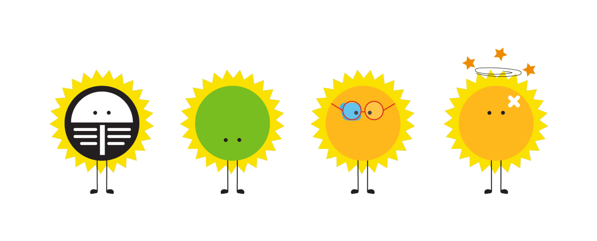
  • Sunny in a variety of settings including within the hospital and getting an x-ray
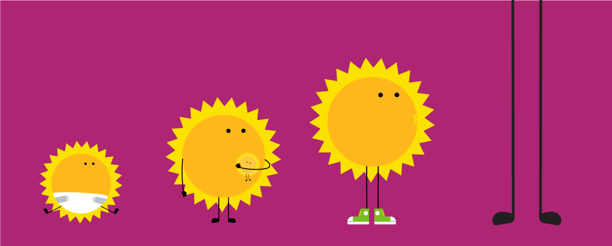
  • Sunny at different ages
  • Sunny celebrating diversity, including religion and LGBTQ+, as well as holidng an I Love NHS flag
  • Sunny incorporated within other objects, such as mugs, boots, wearing headphones etc.

You can find the different image options by searching for Sunny in the media manager.

We also have a dotted line that you can use to break up sections on the page. You can insert this by adding a 'code droplet' to the top row/article header/content areas from layout view. Code droplets can be found under 'tools' and this one is called YBH: Horizontal dotted line.

YBH image of Sunny amongst religious symbols on a blue background

Displaying your images

You can choose to display these images in a variety of ways

  • Full width (such as the image below), by placing just an image in the main content section of your text content and selecting the style placement "Barts Children - featured header/intro"
  • By using a yellow feature box (such as this). You can choose this by selecting the "Barts - split text - image left or right yellow" option
  • By using a white background (such as the mugs above). You can choose to have the image on the left or right and choosing the "default" Barts - split text - image left or right
YBH image example showing Sunny with headphones on a pink background

Add a feature to your page

To promote our YES and our charity

These are set pieces of text content called: 

  • YBH: YES feature
  • YBH: Charity feature
Join YES

Join YES

Be part of our youth empowerment sqaud

The Youth Empowerment Squad (YES) is our youth forum made up of young people who have experience of being in hospital. 

Improving hospital experiences for young people is their passion and they welcome new members. 

Join the squad

YBH image example of Sunny in a boot on a green background

Donate to our charity

And support Sunny 

Barts Charity invests in inspiring people, healthcare projects and ground-breaking research, driven by one uniting goal: to transform the health of our east London community.

Make a donation today

Video placement

Adding a video

Adding a video to your page

Film content is more engaging than text alone, so promote your films on your landing page.

I've created this using a content collection and styled with the placement style "Barts Children - video placement left or right (yellow)".

To create a content collection:

  1. Create your pieces of text content. This will be a separate piece of text content for your film and your text. Name them using our naming style: page name: subject
  2. Your video size should be 450 high and 100% wide. You change these sizes in the 'source' code in the text content.
  3. Under publishing in the CMS menu, click the plus next to content collection.
  4. Name your content collection using our naming style and add a headline.
  5. You don't need to select a type.
  6. Search for your pieces of text content within the "text items" field.
  7. Publish to site.
  8. Turn the heading off on your content collection by selecting edit content collection from the layout view and selecting no headline.